Silver Online Service
Connecting Seniors to Digital Helpers
Draft notice: this case study is drafted from the live keer.webflow.io page content and needs a final pass before it's treated as finished copy — in particular the outcome/impact section, which the original page doesn't quantify beyond the research statistics below.
Overview
Silver Online Service (SOS) is a mobile app which allows the elderly to seek help from volunteers regarding their smartphone issues. I came aboard the startup as a product designer a year after its beginning. There was already prior research done to validate the app idea, and most of my work with the team involved working on the user experience of the app, as well as user research and testing.
My Contribution
UX Research, UX/UI Design
Collaborators
Claudia Lai, Darren Ho, Clarrisa Chan, Muhammed Irfan, Reina
Date
May 2023 – Nov 2023
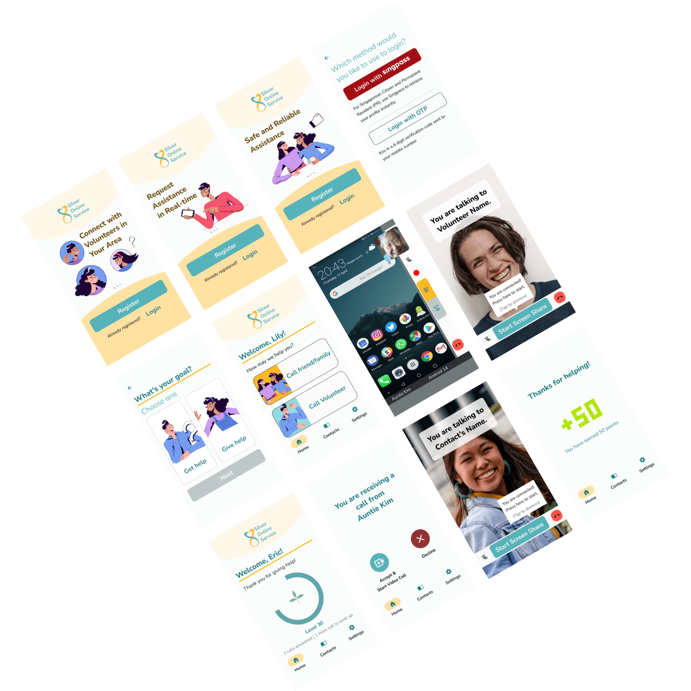
SOS is centred around community support: the app collaborates with a dedicated group of volunteers to deliver real-time assistance in navigating smartphones. Its call function lets volunteers seamlessly guide seniors through their smartphone interactions — screen-sharing, direct annotation, and a text function alongside voice — so seniors get tailored help within a supportive community.
"I am scared that if I press wrongly, then everything will be gone. I have a lot of songs inside my phone." — Madam Cheong Kit Moi, 78
The Problem
Many seniors live in isolation and lack someone to turn to for smartphone help. In Singapore, a significant number of elderly individuals face challenges with smartphone usage, especially those living alone. Our team's study revealed that 81% of interviewed seniors struggle with smartphone issues, 52% of them live alone or with a spouse, and 44% lack adequate support from younger family members in navigating their smartphones.
Many seniors are unfamiliar with technology and have low digital confidence. Having lived through times before the technological revolution, many in this generation find it hard to interact with smartphones due to a lack of a common language with these devices, sometimes perceiving technology with hostility or anxiety (Leonardi et al., 2008). IMDA research found that seniors aged 60+ form the lowest percentage (69%) of any age group with wireless internet access via a portable device (2019), citing a lack of smartphone knowledge, language literacy, and confidence.
Decreased motor and cognitive skills compound a lack of design consideration for elderly users. Age-related declines in motor and cognitive ability make apps harder to use, and most apps and software aren't designed with elderly users' different abilities in mind, since this group isn't typically treated as a primary market.
Research
With frequent visits to an elderly centre, our team recruited seniors for interview and testing sessions to understand how they currently used their smartphones and how they experienced our prototype.
Set-up needed improvement. During the first testing session, some team members reached out physically to assist participants, inadvertently reducing how accurately the session measured the prototype's own helpfulness — we adjusted the experiment set-up for the next round to address this.
Varying levels of digital literacy and willingness to learn. I reviewed all prior research material, helped conduct further user interviews, and consolidated everything with another product designer into a shared Miro board — giving the team a clear view of elderly users' pain points, comfort levels with technology, keenness to learn, and how they currently sought help with smartphone problems.
Technical and Usability Issues Identified
Testing surfaced a cluster of issues: the elderly user's phone dimming or locking mid-call with a volunteer; network issues causing the app to crash or reset mid-call; the video window blocking part of the screen, preventing the elderly user from tapping or the volunteer from annotating that area; a slight time lag between a volunteer's annotation and its appearance on the elderly user's screen; and elderly users tapping instead of swiping, depending on how clearly a volunteer's instructions or annotations communicated the gesture.
Design
Reviewing research findings and user sessions together as a team built empathy for who we were designing for. I paid particular attention to making the visuals and navigation more accessible to elderly users, adhering to WCAG AAA guidelines with a 7:1 contrast ratio for all text and icons, and a minimum font size of 16px.
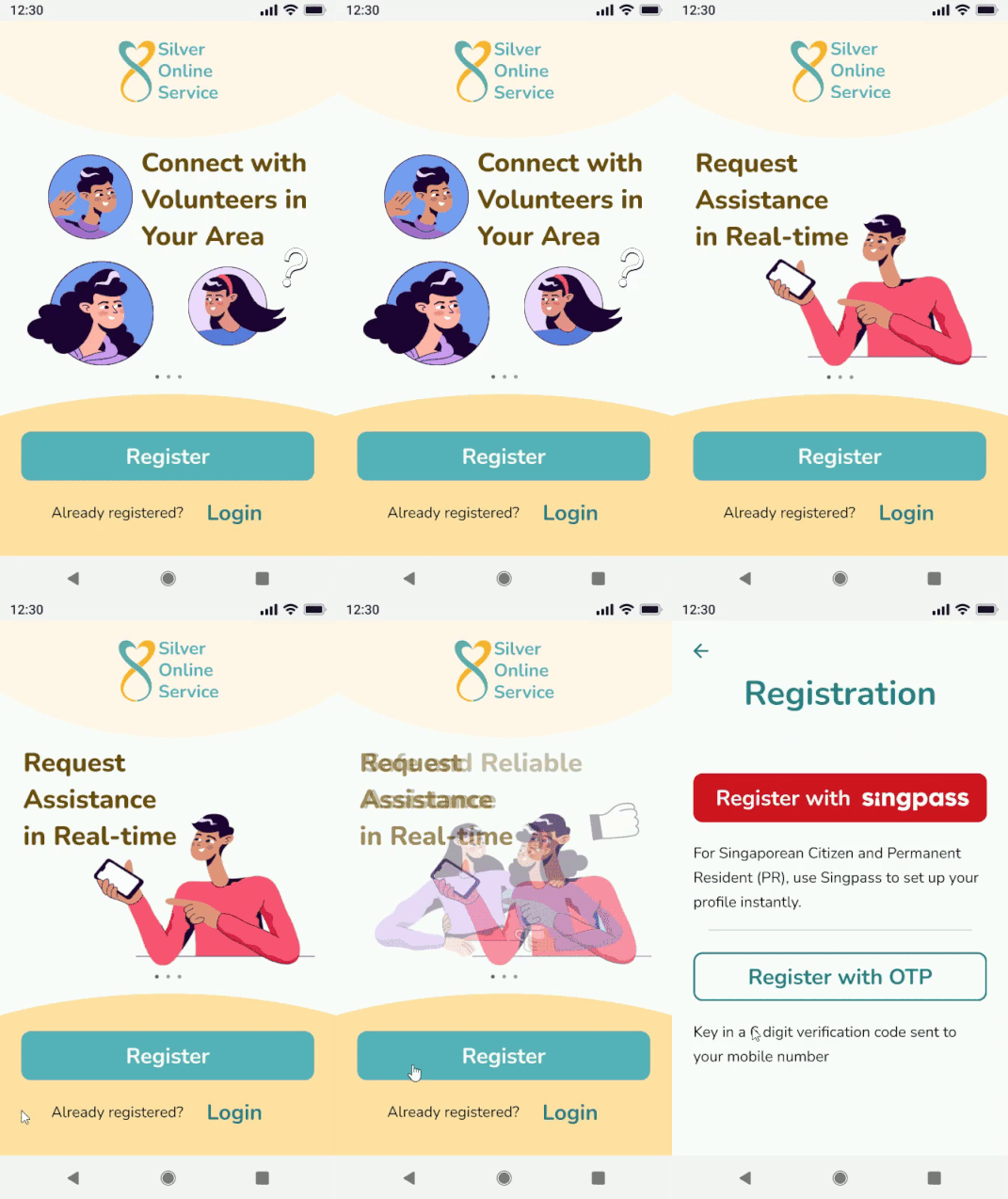
Ensuring a sign-up flow without complicated steps. Using registration as an example, I wanted the steps to be as simple as possible so nothing would deter a user from finishing. Singpass is offered as an easy, secure sign-up option; for users who hit authentication issues, an OTP sent to their mobile number serves as a fallback — ease and convenience of login were a priority throughout.
Designing for unhappy paths when making or answering calls. Beyond the happy path, I considered what happens if no volunteer picks up, or if the elderly user gives up on the help request partway through.
Guiding elderly users to swipe, not tap. Testing showed volunteers struggled to guide elderly users through swipe gestures verbally. I designed pictorial cue animations for all four swipe directions (up, down, left, right) as a faster, clearer way to communicate the gesture than words alone.
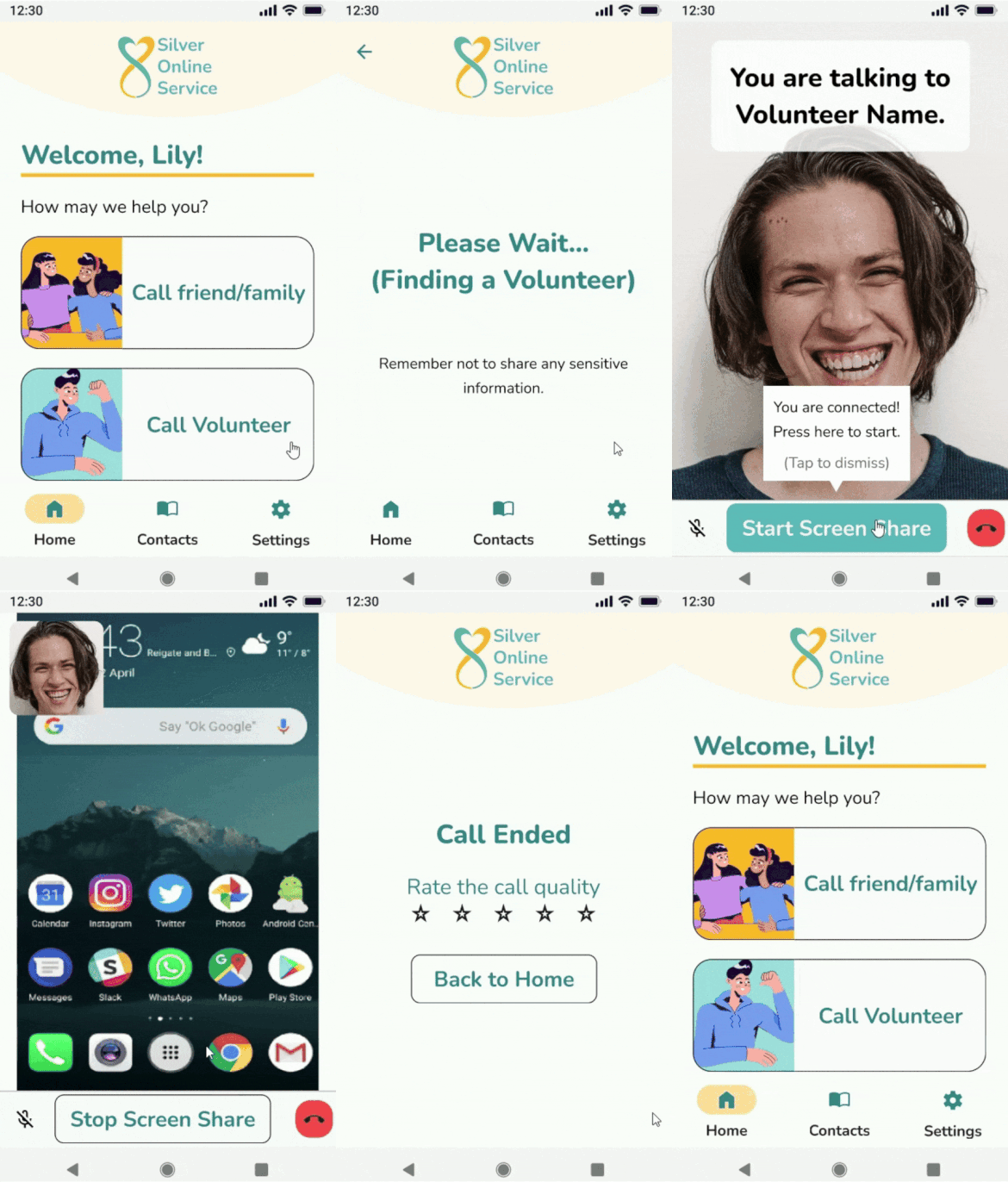
Inserting opportunities to connect. I observed that elderly participants were initially hesitant and slow to warm up to a volunteer's guidance, likely from the lack of any "warm-up" period before two strangers connected. I revisited the user journey for a moment where both sides could simply say "Hello" on first connecting, as an icebreaker.
Increasing inclusivity through UX writing. After discussion with the team, we redesigned how volunteers and elderly users chose their roles during onboarding, revising the phrasing so elderly users seeking help didn't feel differentiated or singled out because of their age.
Next Steps
Through this project, I learned the value of in-depth research and direct user interaction — engaging with elderly users directly surfaced crucial insights into their daily realities that shaped an app genuinely built around their needs. I also came to appreciate how much a well-structured testing setup matters: getting the session design right minimizes inaccuracies and keeps the team's effort pointed at improvements that actually matter.